Kings of typography
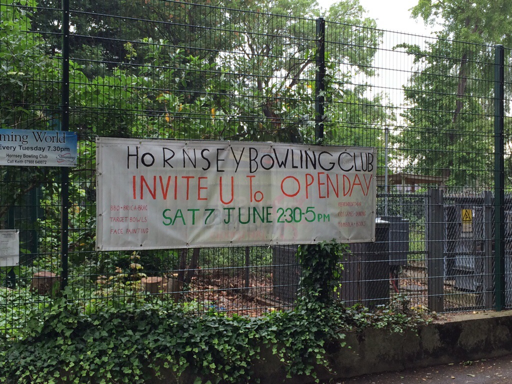
There’s something charming about a wonky sign isn’t there? If nothing else it captures your attention for a brief second to contemplate the mental state of whoever was given the responsibility of committing paint to oversized water-proof canvas.
Here’s one for you. At first glance it looks like the sign for a school fate- but look closer…it’s not though is it? It’s for a bowling club. Now unless trends have very much shifted here in Hornsey- I’m pretty sure that everyone who’s a part of that club is over 9 years of age. Therefore there’s lite excuse for using a letter “U” instead of the word “you”…I mean, you do know why the kids USED to substitute the letter for the word, right? Because back in the day we were limited to the amount of characters that we could send in a text message- so knocking out two characters gave us more chance to embarrass ourselves in a drunken text. Not sure why the decision to use it on this banner was taken when it’s the size of a frigging BUS! Like you didn’t have enough room for three letters? Clearly not as by the end you seem to have miss judged how long your words were going to be and have crushed them into the last inch of space. Also what’s with the different heights? Come to think of it; how come “you” lost out to the word “to”? Why wasn’t he substituted to the number “2” to really get down with the kids and strike a steak through the English language… Vampire (?).
One or the other kids, either you shorten everything or nothing. In fact your poster should have actually read:
Hornsey Bowlin CLB Invte U 2 open day- please check your brains in at the door (dribble)


